Friday, 30 March 2007

Conclusion (Final Post)

In January 2007 our HCI group received the following task:

You have to design a piece of technology to support either children (up to age 11) or the elderly (approximately, over 65). You can make assumptions about the technology if you wish, and there can be futuristic elements within it, though these should be explained. You do not have to implement the design to create a fully functional working system.


Through the user centred design process of developing our technology, our group has covered the following module learning outcomes:
  • Learning Outcome 1: Explain and discuss practical and theoretical aspects of Human-Computer Interaction.
  • Learning Outcome 2: Apply HCI principles to practical problems
  • Learning Outcome 3:Participate in analysis and design work in HCI.
This is demonstrated through the posts presented below.


1. Define user group/target audience
Meeting 1: Target Age Group Discussion


2. Initial requirements gathering/problem definition
Meeting 2: Target Age Group Brainstorm
Problem Definition: Web Access for Older Users
Web Usability for Older Users

3. Creative design
Meeting 3: Initial Product Ideas
Meeting 4: Personas Discussion
Why Personas?
Pseudo Task Analysis: PC Internet Access
Persona 1: Norman Collier (85)
Persona 2: Rebbecca Green (68)
Persona 3: Derek Wilkins (61)
Persona 4: Maureen Smith (75)

4. Prototype design
Netbox : Product Summary
Netbox: Hardware Prototype
Netbox: Product Software
Netbox: Input Device
http://mschci2007.blogspot.com/2007/03/prototype-2-input-devices.html

5. Testing prototype – questionnaires /personas
http://mschci2007.blogspot.com/2007/03/task-analysis-goals.html
http://mschci2007.blogspot.com/2007/03/task-instructions.html
http://mschci2007.blogspot.com/2007/03/task-3-instructions-sending-email.html
http://mschci2007.blogspot.com/2007/03/task-4-instructions-accessing-and.html
http://mschci2007.blogspot.com/2007/03/sending-and-receiving-emails.html
http://mschci2007.blogspot.com/2007/03/task-analysis-derek-wilkins.html
http://mschci2007.blogspot.com/2007/03/maureen-task-1-connection.html
http://mschci2007.blogspot.com/2007/03/task-analysis-norman-collier-85.html
http://mschci2007.blogspot.com/2007/03/prototype-questionnaire.html
http://mschci2007.blogspot.com/2007/03/prototype-questionnaire-refinement.html
http://mschci2007.blogspot.com/2007/03/questionnaire.html
http://mschci2007.blogspot.com/2007/03/prototype-questionnaire-response.html
http://mschci2007.blogspot.com/2007/03/prototype-questionnaire-answers.html
http://mschci2007.blogspot.com/2007/03/rebecca-answers.html
http://mschci2007.blogspot.com/2007/03/prototype-user-questionnaire-response.html
http://mschci2007.blogspot.com/2007/03/for-evaluation-of-three-new-prototype.html
http://mschci2007.blogspot.com/2007/03/prototype-2-walkthrough-derek-wilkins.html
http://mschci2007.blogspot.com/2007/03/rollerball-remote-control-rebecca.html

6. Critical appraisal of prototype
http://mschci2007.blogspot.com/2007/03/results-of-initial-prototype-analysis.html

7. Redesign
http://mschci2007.blogspot.com/2007/03/final-redesign.html

8. Evaluation
http://mschci2007.blogspot.com/2007/03/heuristic-evaluation-10-principles.html

Thursday, 29 March 2007

Final Redesign

Our final design attempts to address the majority of issues that arose from our first two prototype stages. We will separate this into individual sections below:

HARDWARE

The key issues that arose here were that the initial size of the netbox unit meant that people could not fit the unit underneath their television set. We have therefore made netbox slimmer, to achieve this outcome. We also want to offer the user achoice of colours, as this seems to be important to people too. Therefore the final netbox unit will be available in two colours, silver and black.


INPUT DEVICE

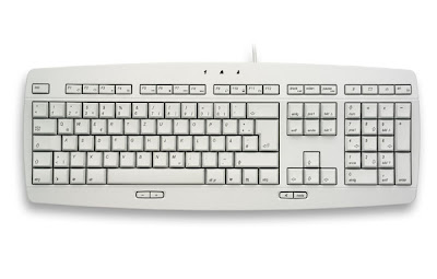
The key issue here was that people had considerable difficulty typing text using the original remote control. We original mobile phone style text input design proved too troublesome for older users who were largely unfamiliar or inexperienced with this method of input. We therefore redesigned the remote for prototype 2 and offered the user a wireless keyboard for typing. From prototype 2, the preferred remote control was the one using the touch pad to navigate across the screen. We therefore decided to choose this style for the final design, however, we wanted to go back to our original aim of having one input device. We therefore chose to have a thin, minimalist keyboard as part of the remote control, which is accessible by pulling out the keyboard from the side of the remote control. This feature was inspired by new technology reported here:

http://news.bbc.co.uk/1/hi/technology/6345869.stm


Touchpad navigation with bottom 'select' button,
built-in voice recognition and scroll out mini keyboard.

SOFTWARE

The original software used in the first prototype was well recieved. People particularly liked the new way that internet pages were displayed using the simplified format we introduced. For the final design, we have:
  • Introduced an on-screen video companion that can guide people if they are having trouble. This feature is fully customisable, in that the person can be changed, as well as their voice, or the feature can be turned off completely. This improves the overall user experience by making access to all of the netbox features through this guide and provides users with a friendly 'person', with whom they can interact, rather than just being faced with a succession of text-based menu screens.
  • The user can asks questions to the video companion through talking into the remote control. The video companion responds through the TV output speaker.
  • The main menu used numbers from the keypad in the original. These have been removed because people preferred to use the controller to navigate through the menu.
  • We have also introduced a new graphical interface resulting in a more intuitive, user friendly display.
  • We have changed the email application to allow easier access to the individual's account.
  • We changed the chat login name to be the same as the email name.
  • Chat software now allows users to talk to each other directly, as well as providing speech to text functionality so that conversations can be transcribed for those who are deaf or hard of hearing.
A demonstration of the improved menu system, featuring the video guide, is available by selecting the link below.

Wednesday, 28 March 2007

Heuristic Evaluation: 10 Principles

We are utilising the ten general principles for user interface design, as outlined by Jakob Nielsen. This method has been chosen to evaluate Netbox since it allows us to utilise the below principles to analyse the usability of the user interface and identify any related problems in its design. An outline of each principle is given in italics below each heading.

1.Visibility of system status
The system should always keep users informed about what is going on, through appropriate feedback within reasonable time.

As buttons are pressed, menu or icons are highlighted, giving the user an indication of how they are interacting with Netbox. Each function, whether it be chat, email, or internet, has a main menu through which the user enters and, each screen has identifiers that enable a user to recognise where they actually are (i.e. in chat, email, or inernet). Since we anticipated that the system would be impervious to any lag time, we did not require the use of an messages or icons conveying to the user that a particular process was for example, "loading".

2.Match between system and the real world
The system should speak the users' language, with words, phrases and concepts familiar to the user, rather than system-oriented terms. Follow real-world conventions, making information appear in a natural and logical order.

Netbox's technology has always been grounded in the real world. That is, the technology is based upon that which is currently available and therefore familiar to our particular target group. The remote control for example evolved from a model based upon those traditionally available for devices such as TVs, DVDs etc, our mantra being that familiarity should be of great importance to our particular age group.Additionally, we 'stripped-down' the language used in conventional systems so as to "speak their [the users'] language", the purpose being to make navigation more intuitive.

3.User control and freedomUsers often choose system functions by mistake and will need a clearly marked "emergency exit" to leave the unwanted state without having to go through an extended dialogue. Support undo and redo.

Each screen that a user navigates through has a title at the top, indicating which area of the system they are in at any given time. Additionally, each screen also has a large, obvious "main menu" and "back" facilities. Furthermore, the remote control also has a "menu" button which, when pressed, takes the user to the main system menu.

4. Consistency and standards
Users should not have to wonder whether different words, situations, or actions mean the same thing. Follow platform conventions

Each screen of the user-interface follows a standard format and offers similar functionality (see above heuristic for examples) so as to be consistent. Within each subsystem (i.e. chat, email, internet), the touchpad and keypad have standard functions. The touchpad allows navigation around screens and speech recognition has standard commands.

5. Error prevention
Even better than good error messages is a careful design which prevents a problem from occurring in the first place. Either eliminate error-prone conditions or check for them and present users with a confirmation option before they commit to the action.

The addition of "exit to main menu" and "back" and other similar functions in each screen, allow users to always have control over where they wish to go and, together with screen titles (indicating their location) prevent a user from getting lost. Elimination of keypad text input (substituted with a keyboard and speech recognition) removed the major identified error from our system, so users no-longer stumbled when attempting to enter text.

6. Recognition rather than recall
Minimize the user's memory load by making objects, actions, and options visible. The user should not have to remember information from one part of the dialogue to another. Instructions for use of the system should be visible or easily retrievable whenever appropriate.

Font size for on-screen text is ideal (as deduced from questionnaire responses), icons are large and uniform throughout subsystems; dark colours are used for text to aid visual recognition of text, and icons illuminate when a user navigates to them.

7.Flexibility and efficiency of use
Accelerators -- unseen by the novice user -- may often speed up the interaction for the expert user such that the system can cater to both inexperienced and experienced users. Allow users to tailor frequent actions.

Netbox has numerous ports through which various peripherals can be connected (such as a keyboard), and the innovative web-translating software can be disabled so that experienced users can use the internet in a conventional manner. We thought this would appeal to the older generation, since it would allow their younger relatives to utilise the system, perhaps also removing the stigma from a device that may be perceived as "technology fot the older generation".

8. Aesthetic and minimalist design
Dialogues should not contain information which is irrelevant or rarely needed. Every extra unit of information in a dialogue competes with the relevant units of information and diminishes their relative visibility.

Compared to conventional systems, Netbox has a "stripped-down" user-interface geared toward basic functionality (unless some of the software is disabled, such as in the above instance). Only few options are given per page, but all of these are vital for the functionality required. The minimalistic, "geared-toward-function" design is refelected by the simplicity of the main menu consisting of only 4 main options (5, including "help")


9. Help users recognize, diagnose, and recover from errors Error messages should be expressed in plain language (no codes), precisely indicate the problem, and constructively suggest a solution.

The simplicity of our system, as far-fetched as this may seem, renders it impervious to any software errors. Faced with major hardware errors (such as failure), the system simply shuts-down. Once of the major identified problems is that users will perhaps find it difficult to connect the Netxbox hardware. For this we provide a set of conventional instructions. This is a problem that requires further exploration. However, if a cable comes free from the device, a message and diagram will appear on the screen, directing the user to where the cable has become unplugged. This occurs even if the power cable becomes unplugged, since power will be temporarily provided by an internal battery.

10. Help and documentation
Even though it is better if the system can be used without documentation, it may be necessary to provide help and documentation. Any such information should be easy to search, focused on the user's task, list concrete steps to be carried out, and not be too large.

Netbox comes with conventional instructions and additional help available via the "Help" facility available on each screen.

Prototype 2 Walkthrough - Rebecca Green

Rollerball Remote Control

Rebecca commented that she likes the traditional arrow buttons on the former controller but that this was easier to hold.
Her comments were:

  • You know, this feels far more natural.
  • I'm not sure I like it more than the arrow buttons though.

We loaded the internet function on netbox and navigated to a website that contained several hyperlinks, and asked Rebecca to move around the screen choosing particular links.
Her comments were:

  • It's not difficult to use...but I didn't find the arrow buttons difficult either.
  • Sometimes my thumb feels like it wants to keep on rolling when I really should stop.That makes it difficult to stop on something on the screen.

Touchpad Remote Control

Rebecca comment that the controller looked "very space age" and stressed that she hoped it wouldn't make her feel stupid.
Her comments were:

  • This is a lot different to both of them. It's actually easier to use than both I think (as she intuitively placed her thumb on the pad)

We again asked her to perform the same process with this remote.
Her comments were:
  • This is nice. It doesn't make my thumb ache eiter.

  • It feels quite natural.

'Wii'-Style Controller

Her initial remarks about this remote were:
  • Where are the arrow buttons? How do I use this?
When she performed the task again (after instruction about how touse the remote), she said:
  • I think my arms will hurt if I keep doing this. It's like a computer game!
  • My nephews would love this though!
Keyboard and Speech Recognition System

Rebecca's initial response to the keyboard and new speech recognition feature was:
  • I used to be a typist. I never thought you'd show me something that I'm familiar with!
  • You say I can talk to Netbox? How?
After an explanation we asked her to send an email using both the keyboard and the speech recognition system from one of the remotes.
Rebecca's response using the keyboard was:
  • Reminds me of being a typist. We didn't have any of this electronic stuff though. It is easy to type, isn't it?
  • Why didn't you sue this before? It's much easier than that silly remote you first gave us!
Rebecca's response using the speech recognition system was:
  • This is brilliant! I told you I didn't want to feel stupid using technology but I didn't think you'd make me comfortable with it! How does it know that I don't want to speak to it if I'm speaking to my family?
  • I like this very much! Can I use it to navigate the menu?

Prototype 2 Walkthrough - Derek Wilkins

Rollerball Remote Control

Derek initially examined the remote and began moving the rollerball around with his thumb.
His comments were:

  • This feels quite comfortable.
  • I like it more than the original controller.

We loaded the internet function on netbox and navigated to a website that contained several hyperlinks, and asked Derek to move around the screen choosing particular links.
His comments were:

  • I like the way I can zoom around the screen.
  • It's quite hard to stop on a particular link.

Touchpad Remote Control

After initial examination, Derek seemed a little unsure about how this remote control would work.
His comments were:

  • This remote feels a little lighter than the previous one
  • So I just move my thumb across the pad to move the cursor on the screen.
We again asked him to perform the same process with this remote.
His comments were:
  • Wow, this feels so much better.
  • I feel like I am really in control of the cursor.
  • It feels quite natural.

'Wii'-Style Controller

His initial remarks about this remote were:
  • Seems very similar to the last one
When he performed the task again, he said.
  • It's quite hard to point to a specific location on the screen.
  • My arm aches a little after using this remote.
Keyboard and Speech Recognition System

Derek's initial response to the keyboard and new speech recognition feature was:
  • I am so glad to see a keyboard. I hated the way I had to type test on the first remote control
  • So, where do I talk into the remote?
We asked him to send an email using both the keyboard and the speech recognition system from one of the remotes.
Derek's response using the keyboard was:
  • This is a lot better.
  • It now takes me about 1 minute instead of 5 minutes using the old system.
Derek's response using the speech recognition system was:
  • I can't believe I can just talk into the remote and the text appears on the screen.
  • It feels a little wierd talking to a remote control.
  • It's so easy to use.

Prototype 2 Walkthrough

For evaluation of the three new prototype remote controls, we constructed a setting in which each person(persona) had the opportunity to use each controller for particular tasks. During these tasks, the person was encouraged to voice their thoughts as they performed actions. It was thought that such a process would reveal additional information about the cognitive processes employed by the subject as they experimented with each new controller and, in turn, highlight issues regarding the design. Additionally, the subject was encouraged to ask any questions they may have about the controller functions. Each subject was given the task of using the internet option (as in the former task analysis) and composing an e-mail. For the second task, the subject was informed that they must use both the keyboard and speech recognition facilities to complete the task. For this process we selected Derek, who had stated in his questionnaire responses that he found the controller to be cumbersome, and Rebecca, who had difficulty with every task during Task Analysis.

Tuesday, 27 March 2007

Prototype 2 - Input Devices

Prototype 1, left, with Prototype 2 redesigns

The aim of prototype 2 is to address the major issue that arose from testing of prototype 1, which was the fact that people found it extremely difficult to input text into their netbox remote control. As this is the key fundamental aspect of the netbox product, we have concentrated the whole prototype 2 to addressing this issue.


Our aim in designing netbox is to have a final product that is highly intuitive - that is a user can pick up a netbox product and get it working with very little instruction. In our initial design, we wanted to adopt a minimalist approach to the number of hardware items required to use netbox, which is why we decided that a mobile phone text style system for typing would be good. However, we didn't really anticipate that it would be such a barrier for an elderly person to overcome.

So, for prototype 2, we have introduced a separate keyboard to allow for typing and this will be tried out along with several new remote controls. The aim of using several remote controls is to determine which one is the easiest and most comfortable to use. We found that our original controller was cumbersome, with people finding it hard to navigate around the screen due to the restricted movement option. So, in designing our new remote controls, we have tried to introduce more free flowing movement around the screen.

Finally, we wanted to explore the option of removing the need for a keyboard by introducing a voice controlled typing mechanism, or 'Talk Type', that allows the user to input text into netbox by using their voice alone. This is facilitated through the means of a microphone incorporated into the remote control handset.

  • Wireless keyboard

  • Remote control 1: Rollerball. This contains a rollerball that allows the user to scroll quickly and efficiently around the screen. We believe that this is an improvement on the up, down, left, right control from the initial remote.

  • Remote control 2: Touchpad. This contains a touch pad that allows the user to move their thumb or finger across a touch pad on the remote control to position the cursor on the screen. Again we believe this is a better option.

  • Remote control 3: Standard Button with Wii-style motion sensing. This is a completely interactive remote control and as it employs the 'wii'-style system of pointing to the screen where you want the cursor to be placed.
The built-in microphone, incorporated in to each handset, allows the user to be able to 'talk type' text input into their netbox.

Sunday, 25 March 2007

Results of Initial Prototype Analysis

Now that our initial prototype has been tested, and the questionnaire and task analysis is complete, we are in a position to assess the deficiencies of the product. Before we go into detail about this though, there was a glaring issue that came out of virtually every test, which we have to deal with immediately. This issue concerns the way that the user inputs text. Initially, we wanted our remote control to be the only input device that was used with netbox, and so chose to implement the mobile phone text interface into it. However, our target market found this almost impossible to use and became very frustrated when using netbox, particularly in the more text intensive applications. It quickly became clear that having just the remote control was not going to be enough, therefore we need another way to input text. We are therefore going to have another prototype stage that looks at the issue of typing text. There are two ways that we will look at:


  • 1. A keyboard of some description.
  • 2. A voice function that allows the user to talk into the remote control and that writing to appear on screen.

We will also look at some alternative remote control designs during this prototype stage.


The other issues that arose are detailed below, however, these issues are deemed non-critical and can be dealt with when we perform the prototype redesign.


  • The shape of netbox was a problem for some people. We need to flatten netbox so that it can fit under people's television sets.
  • One user commented on the colour of the box. We need to offer user's a choice between silver or black.
  • User's had trouble recognising and connecting the modem. The modem has to be more clearly labelled and the instructions need to be more specific. Perhaps a graphical walk-through will be more appropriate for this task.
  • Nobody used the bundled webcam, which was supposed to be a feature of netbox that would be of most value to the user. The webcam needs better documentation and needs to be an option within the menu system that people can choose.
  • No-one used any peripherals, such as a memory stick or digital camera card. Do we need netbox to perform these tasks, or should we remove this functionality?
  • The menu system was criticised by some people. Do we actually need an on-screen menu system, or can we integrate this into the remote control?
  • The remote control buttons were too close together for many people. This issue will be addressed by the introduction of a secondary input device. We can therefore remove the textpad from the remote and have only the most basic functions, such as menu choices, along with select and navigation buttons.
  • The navigation itself was an issue. We will look at several options in the next remote control prototype, including things such as a rollerball, touchpad and a nintendo wii style screen pointer.
  • One user found that the text on the screen was still too small despite the improved style web look that we implemented. We need to implement a zoom control on the remote that allows the user to control the size of the text on the screen.
  • User's mentioned that they would like to be able to be able to 'talk-type', that is using there voice to input text. This gave us the idea that we could implement a voip element into netbox using the remote control as a voice input device. This will be implemented into the final design.
  • User's also commented that they were sometimes confused when using the different functions of netbox. We are therefore going to implement an optional on-screen helper, that can guide the user through particular tasks. This will be in the form of a virtual person who the user can click on for advice.

Monday, 19 March 2007

Pause for Thought: An Interesting Perspective...

This brief paper ("Accessibility and interfaces for older people – a unique, but many faceted problem") highlights some of the issues we've encountered along this exercise in UCD. The author suggests that the standard methodology of User Centred Design is not appropriate for designing for our user group. He proposes that the techniques of UCD need to be modified to be appropriate to older people as the user group. Like I said: interesting...

Wednesday, 14 March 2007

Minutes of Meeting

We reviewed our progress thus-far and discussed creative design, prototype design, and prototype testing. Within these contexts, we decided that the following aspects should be finalised ASAP:

Questionnaires
Discussed current format of prototype questionnaires and decided that all personas should answer. Agreed that, once provided, these will allow us to evaluate:

  • How the questionnaire should be modified (are questions too simple? Do they provide insight into design issues?)

  • The limitations of questionnaires in general

  • whether we also need to employ interviews or alternative methods to aid design

User Interface/Software

Strictly speaking, the menu through which an individual will interact with Netbox. Agreed that we need to specify the design for the menu and other major 'landscapes' through which our personas will navigate.

Input Device

We envisage that answers to questionnaires/interviews/task analysis may dictate that we make major changes to the prototype. Key ares discussed were:

Dimensions- Are there dimensions that all will be comfortable with? Could we make the controller from a substance that is robust and malleable, so that the shape can be moulded by individual users? This could provide maximum comfort.

Keyboard- Does Netbox require a keyboard? We decided that the Email facility in particular requires the use of such an input method. Mobile-phone type input was rejected on the basis that it would be too cumbersome.
Where should the keyboard be? Should it be on the main controller? If so, what form does it take? One intriguing suggestion was a collapsible/folding keyboard which becomes rigid when in use. Another suggestion was a projected keyboard. As an alternative to a pointing device or on-screen cursor, eye-tracking was even suggested.

Task Analysis

Prototype design should be complete so that we can progress with task analysis and identify key areas that may require modification or complete reconsideration.

Questionnaire Response - Norman Collier (85)

1. What did you use Netbox for?
Browsing the internet
Email
Chat


2. Would you like to see other features on Netbox? If so, please write them in the following space:
I would like to be able chat properly with people and enter words on the screen with my voice rather than that awful text message type thing. I also found the NetBox quite impersonal - the help menu was OK but finding out how to do things did seem very clinical and not very friendly.

3. Did you connect Netbox (plug it all in) by yourself?
Yes - although my son gave me a bit of help.

If you chose 'No', please do not answer question 4 - go straight to question 5.

4. How long did it take to connect Netbox?
1 to 2 hours

5. What things (if any) did you connect to Netbox ?
Web camera

6. If you did connect any of the above, was the input (where you connect it to) difficult to find?
No

7. How easy was the remote control to use?
Difficult

8. Was the remote control?:
Just right

9. Were the buttons with numbers?:
Just right

10. What would you change about the remote control, if anything?
I found the text input very hard to use and although I became used to it by the end of the month I still found it very tedious indeed - I'd much rather type words into the NetBox with a keyboard - or better still with my voice! The remote control was quite intuitive, because it was very similar to my DVD player remote control, but I soon discovered that surfing the web and sending emails was nothing like using a DVD menu!

11. Was the remote control comfortable to use?
Yes

12. Was the main menu (displayed below) easy to understand?
Yes

13. Was the surf the web option (displayed below) easy to use?
No

If you chose 'Yes', please do not answer question 14 - go straight to question 15.

14. What did you find difficult about the surf the web option?
Entering web addresses and search words with the remote control!

15. Was the writing on the web-pages that you viewed?:
Just right

16. Was the view your email option (displayed below) easy to use?
Yes

If you chose 'Yes', please do not answer question 17 - go straight to question 18.

17. What did you find difficult about the view your email option?

18. Was the chat and socialise option (displayed below) easy to use?
No

If you chose 'Yes', please do not answer question 19 - go straight to question 20.

19. What did you find difficult about the chat and socialise option?
Again, it was the remote control. I'd much rather chat with people by actually talking to them.

20. How many hours did you use your Netbox over the trial period?
5 to10 hours

21. What did you like about Netbox?
I liked the way it was simple to use and it meant I didn't have to learn how to use a computer in order to surf the web and send emails. It was just easy and straightforward - it was also great being able to see my family on the TV using that web camera thingy!

22. What did you dislike about netbox?
Just the remote control really. It was difficult to move down web pages and it was difficult to enter text. It was also a bit too big - I couldn't fit it in my TV cabinet!

Questionnaire Response - Rebecca Green

1. What did you use Netbox for?
Browsing the internet
Email
Chat


2. Would you like to see other features on Netbox?If so, please write them in the following space:

3. Did you connect Netbox (plug it all in) by yourself?
No

If you chose 'No', please do not answer question 4 - go straight to question 5.

5. What things (if any) did you connect to Netbox ?
I don't know

6. If you did connect an of the above, was the input (where you connect it to) difficult to find?
I don't know

7. How easy was the remote control to use?
OK


8. Was the remote control?:
Just right


9. Were the buttons with numbers?:

Just right
Too close together


10. What would you change about the remote control, if anything?
I would make the shape more comforatble and the buttons easier to use.

11. Was the remote control comfortable to use?
No

12. Was the main menu (displayed below) easy to understand?
Yes

13. Was the surf the web option (displayed below) easy to use?
No

If you chose 'Yes', please do not answer question 14 - go straight to question 15.

14. What did you find difficult about the surf the web option?
(no answer provided)

15. Was the writing on the web-pages that you viewed?:
Just right


16. Was the view your email option (displayed below) easy to use?
No

If you chose 'Yes', please do not answer question 17 - go straight to question 18.

17. What did you find difficult about the view your email option?
(no answer provided)

18. Was the chat and socialise option (displayed below) easy to use?
No

If you chose 'Yes', please do not answer question 19 - go straight to question 20.

19. What did you find difficult about the chat and socialise option?
(no answer provided)

20. How many hours did you use your Netbox over the trial period?
0 to 5 hours

21. What did you like about Netbox?
(no answer provided)
22. What did you dislike about netbox?
The controller made me feel stupid sometimes. I don't like to be made to feel stupid. It is not me that's stupid; it's technology that's stupid!

Questionnaire Response - Derek Wilkins

Derek Wilkins

1. What did you use Netbox for?


  • Browsing the internet
  • Email
  • Shopping
  • Chat

2. Would you like to see other features on Netbox?If so, please write them in the following space:

No, I don't think so

3. Did you connect Netbox (plug it all in) by yourself?

  • Yes

If you chose 'No', please do not answer question 4 - go straight to question 5.

4. How long did it take to connect netbox?

  • More than 30 minutes, but less than an hour

5. What things (if any) did you connect to Netbox ?

  • None

6. If you did connect any of the above, was the input (where you connect it to) difficult to find?

  • N/A

7. How easy was the remote control to use?

  • Difficult

8. Was the remote control?

  • Just right

9. Were the buttons with numbers?:

  • Just right
10. What would you change about the remote control, if anything?

I would get rid of the number typing system.

11. Was the remote control comfortable to use?
  • Yes

12. Was the main menu (displayed below) easy to understand?
  • Yes

13. Was the surf the web option (displayed below) easy to use?
  • No

If you chose 'Yes', please do not answer question 14 - go straight to question 15.

14. What did you find difficult about the surf the web option?

It was very hard to type the web address that I wanted. In the end I found it easier just to click on the page links.

15. Was the writing on the web-pages that you viewed?:
  • Just right
16. Was the view your email option (displayed below) easy to use?
  • No

If you chose 'Yes', please do not answer question 17 - go straight to question 18.

17. What did you find difficult about the view your email option?

The same as for using the internet. If it was easier to type, then it would be easier to use.

18. Was the chat and socialise option (displayed below) easy to use?
  • No

If you chose 'Yes', please do not answer question 19 - go straight to question 20.

19. What did you find difficult about the chat and socialise option?

See 14 and 17.

20. How many hours did you use your Netbox over the trial period?
  • 5 to 10 hours

21. What did you like about Netbox?

I liked the fact that I could access the internet while sitting in front of the tv. I quite enjoyed using amazon to buy a book and will do more internet shopping from now on. I liked the way it displayed web pages differently than my computer does.

22. What did you dislike about netbox?

I didn't like the shape, size or colour of the box. It didn't fit under my tv and the colours did not match my tv and dvd player. I thought the remote control was hard to use and it was hard to type out website addresses. I didn't like the way I had to move the cursor around the screen - it just didn't feel natural and I had to concentrate to do it. I didn't like the menu either and so I didn't really use this alot.


Questionnaire Response - Maureen Smith, 75

1. What did you use Netbox for?
Browsing the internet
Email
Chat


2. Would you like to see other features on Netbox?If so, please write them in the following space:
I don't know

3. Did you connect Netbox (plug it all in) by yourself?
No

If you chose 'No', please do not answer question 4 - go straight to question 5.

5. What things (if any) did you connect to Netbox ?
I don't know

6. If you did connect an of the above, was the input (where you connect it to) difficult to find?
I don't know

7. How easy was the remote control to use?
Difficult

8. Was the remote control?:
I'm not sure

9. Were the buttons with numbers?:
Just right

10. What would you change about the remote control, if anything?
I'd make it easier to hold and use.

11. Was the remote control comfortable to use?
No

12. Was the main menu (displayed below) easy to understand?
Yes

13. Was the surf the web option (displayed below) easy to use?
No

If you chose 'Yes', please do not answer question 14 - go straight to question 15.

14. What did you find difficult about the surf the web option?
It was difficult to use the keys to put words on the screen. I didn't know how to get to some letters of the alphabet.

15. Was the writing on the web-pages that you viewed?:
Just right

16. Was the view your email option (displayed below) easy to use?
No

If you chose 'Yes', please do not answer question 17 - go straight to question 18.

17. What did you find difficult about the view your email option?
Like the other thing above, it was difficult to use the keys to put words on the screen. I didn't know how to get to some letters of the alphabet.

18. Was the chat and socialise option (displayed below) easy to use?
No

If you chose 'Yes', please do not answer question 19 - go straight to question 20.

19. What did you find difficult about the chat and socialise option?
The same thing as the other things above. I didn't know how to type words on the screen. Using the arrow buttons was easy though.

20. How many hours did you use your Netbox over the trial period?
0 to 5 hours

21. What did you like about Netbox?
The email, chat and internet are things I would like to use. It would be nice to email my family and chat to them sometimes (maybe with this internet webcam thing).The remote control arrow buttons are like my TV remote, so these are easy to use.

22. What did you dislike about netbox?
I wasn't sure how to use the remote control to put words on the screen. This was very difficult to do.

Tuesday, 13 March 2007

Questionnaire

This questionnaire is the result of addressing the flaws identified in the prototype questionnaire. The rationale/objectives behind the design of this questionnaire have been outlined in a previous post. The questionnaire consists of open and closed questions and aids the recall of participants by utilising pictures of Netbox menus as a memory aid. The questionnaire consists of 5 pages. Click on an individual picture to enlarge it.

Sunday, 11 March 2007

Prototype Questionnaire Refinement

As outlined in the 'prototype questionnaire' post, the purpose of our prototype was to act as a template. It allowed use to define the objectives of the questionnaire (so that we could formulate questions that would elicit useful repsonses) but also helped us to understand the capabilities of the questionnaire format. Upon reflection, we envisaged how each persona may respond to the prototype and came to the following conclusions:

  • The language of the questions needs to be better-targeted to our target personas (some of the questions had been written in language that was familiar to us but may not be to all of our respondents)

  • Questions depend on accurate recall of information that may be difficult to recall

  • There was little room for providing qualitative responses

  • Many "don't know" options had not been included, which we felt risked the possibility of respondents providing false answers to questions

  • We wished to give further consideration to the type of questions we would employ (open/closed etc) and how we could benefit from them


STILL IN DRAFT FORMAT

Saturday, 10 March 2007

Prototype Questionnaire

Why a Questionnaire?

Our objectives (see below for further details) are to obtain feedback that will help us identify any potential problems or User issues.We decided to utilise a questionnaire at this stage since it would be easy to administer and provide participants with the opportunity to respond honestly (as they would not be required to provide details such as name, age etc). The questionnaire does not represent the finished article, rather a collection of the initial questions we wish to ask and the methods we would use. This generated the following:

To enlarge each page of the questionnaire,simply click on the image

Objectives

Naturally, we do not wish to waste both ours and the participants time by asking questions that are superficial and of no real benefit (in terms of supplying information that will aid the design process). Since our prototype product has several key areas of design (functionality, hardware, and software), it is vital that we identify and obtain specific information about each of these aspects.


1. Functionality

  • Identify the Netbox features that people use more than others, or ones that are absent and should be considered for inclusion.

  • Identify aspects that users like (we feel the product should be enjoyable to use)

  • Identify aspects that users dislike


  • 2. Hardware

  • Ascertain whether users can connect Netbox without assistance and, if so, how long this takes

  • Ascertain whether users can connect a peripheral device to Netbox

  • Identify possible problems with the remote control:
    • Is the size manageable?
    • Are the buttons the correct size?

    3. Software

  • Identify aspects of the display that may require refinement

  • Establish whether information is easy to find

  • Establish whether Menu system can be naviagated with ease
  • Wednesday, 7 March 2007

    Task Analysis - Norman Collier

    Task 1: Connecting the NetBox

    Upon receiving his brand new NetBox, Norman was visibly excited at the prospect of finally being able to connect to the world wide web.
    • He opened the packaging and removed the hardware and cables, inspecting each briefly in turn. Norman commented that he was disappointed that there was no user guide for connecting the NetBox.
    • Norman first of all attempted to place the NetBox on top of his DVD player, in his TV cabinet, but realised that the device was slightly too high to fit. He stood for a few moments, perhaps considering where he should put it, before placing it carefully on the floor and picking up the wireless broadband modem.
    • He studied the modem intently before shaking his head and placing this back on the floor too.
    • Norman returned to the small pile of cables and plugged one end of the SCART lead in to the back of the NetBox.
    • Norman plugged the power lead into the socket at the back of the NetBox and then plugged it in at the wall.
    • Norman attempted to plug the other end of the SCART lead in to the back of the television set but could not find the correct socket. He also commented that the cable would not reach from the NetBox's location on the floor.
    • Norman stood for a moment, looking at first the SCART cable and then the modem. He picked up the telephone and called his son for advice.
    • Norman's son arrived 30 minutes later. His son unplugged the telephone from the wall socket, connected the modem in its place and reconnected the phone cable to the modem.
    • His son also struggled to find the SCART socket on the back of the TV and had to drag it away from the wall to access the port. He clearly found this very frustrating and strenuous.
    • His son placed the NetBox on top of the TV so that the SCART lead would reach and connected it to the TV set.
    • Norman turned the TV on and then the NetBox. The NetBox menu screen appeared and Norman turned to his son to thank him.
    • Norman's son experimented with the control and found the settings for text size on the options menu. He changed this so that on-screen text was larger so that Norman could read the screen from his armchair.
    The whole process took approximately 90 minutes. Norman commented that without his son's help he would not have known what to do to complete the task, although believed that a diagrammatic "quick start guide" would have enabled him to understand what the modem was for and made the whole connection process much clearer to him. Nevertheless, Norman admitted he would not have been able to pull the TV away from the wall to connect the SCART lead, as his son had, and would have had to call him anyway to do this as he does not have the strength.

    Task 2: Using the Internet

    Norman was asked to visit the BBC News website with his NetBox.
    • He pressed "Menu" on his remote control and was presented with the NetBox main menu welcome screen.
    • Norman consulted his remote and then the TV screen. He pressed the down arrow and observed the option highlighter move from "1 - Surf the web" to "2 - View your email". He pressed the up arrow and observed the highlighter move upwards again.
    • He commented it was "just like" his DVD remote control and pressed "Select" with "Surf the web" highlighted.
    • Norman was then presented with the "Surf the web" screen and took a few moments to read the screen before proceeding.
    • Norman held the control close to him and referred to a small piece of paper on which he had written the BBC News web address.
    • He pressed "2" and "a" appeared on the screen.
    • He pressed "2" again and "ab" appeared on the screen. "Oh" he exclaimed and consulted the remote.
    • He pressed the left arrow but realised the flashing bar and moved from the end of the input to a position before his last entry. The screen read "a|b".
    • He pressed the right arrow, followed by the "#" key to delete his error.
    • The screen read "a" so he pressed "#" again.
    • Starting over, Norman pressed "2" twice and "b" appeared on the screen.
    • He pressed "2" twice again. The screen read "bb".
    • He pressed "2" three more times, while looking at his key pad, but upon reading "bb2" he realised he had pressed it four times by mistake.
    • "Oh blow" he exclaimed and pressed the "#" button to delete his last character input.
    • He carefully pressed "2" three times and looked up to see "bbc" appear on the screen.
    • He studied the remote and looked for the "." button.
    • He pressed "1" several times and cycled through a variety of punctuation and special characters (such as '_', '&' and '@'). He did this slowly until he eventually reached '.' on his second cycle.
    • Norman commented that it was just the same as his mobile phone and that he didn't like sending texts on that either.
    • With the screen reading "bbc.", Norman pressed "2" three more times, "6" three times, and "1" four times until a full stop was reached. The screen now read "bbc.co."
    • Norman pressed "8" twice and then "5" twice. He looked up at the screen to see the "Enter web address (URL) text field now contained "bbc.co.uk".
    • "Well that was an effort" he exclaimed. He pressed "Select" but nothing happened.
    • He pressed the right arrow and the "Go" button became highlighted. He pressed "Select".
    • A moment later the screen changed to the BBC main website page. The page was displayed with the default, consistent, NetBox page style - black text on a pastel background with red web links.
    • He pressed the down arrow and the highlighter moved down the page to each link in turn.
    • He pressed "Select" when the highlighter was over the "News" link.
    • The screen changed to the main BBC News page.
    The whole process took approximately 30 minutes. Norman commented that he found the arrow navigation quite simple and easy to use but did not like the character input controls on the remote control at all. He said it would take a lot of getting used to and surely there must be an easier way of doing it.

    Task 3: Send an email

    Norman was next asked to send an email to his son, who had provided his email address and was awaiting a communication.
    • He pressed "Menu" on his remote control and was presented with the NetBox main menu welcome screen.
    • Norman pressed the down arrow and then "Select" with the option "2 - View your email" highlighted.
    • Norman was presented with the "View your email" screen and was prompted to enter his email address.
    • Now familiar with the character input controls, Norman entered his email address. He commented that he entered text quicker this time but it was "still a pain".
    • He pressed the down arrow and entered his password.
    • He pressed down and selected "Sign in". A message appeared saying he had entered an incorrect password. He looked up to see his password was concealed with asterisks (********).
    • He entered his password again (his original entry was removed from the text field automatically). He selected "Sign in" again and this time was granted access.
    • On the next screen he pressed the down arrow to select "2 - Write new email". He pressed "Select".
    • Norman entered his son's email address in to the "To" text field. Again, he made a few errors but corrected them.
    • He pressed the down arrow twice, giving focus to the main message compose panel.
    • Using the key pad he typed "Did you get this". He pressed the down arrow once to highlight "Send" and pressed "Select".
    • Five minutes later a message appeared saying "You have 1 new email. Do you wish to read it?". Norman pressed "Select" on the Yes option, which was automatically highlighted (the other option being No).
    • Norman was presented with the "Read your email" screen and his new email was automatically displayed. His son had replied "Yes. Well done, Dad! Love Ken."
    The whole process took approximately 20 minutes. Norman commented that he was getting a bit more used to the input device but still found it problematic. He commented that he was pleased to have sent and received his first email but did not think he would be able to send longer messages using just the keypad device.

    Task 4: Chat and socialise

    Norman was asked to access 'Chat', participate in a brief conversation and exit to the main menu.
    • He pressed "Menu" on his remote control and was presented with the NetBox main menu welcome screen.
    • Norman pressed the down arrow twice and then "Select" with the option "3 - Chat and socialise" highlighted.
    • Norman was presented with the "Chat and socialise" screen and was prompted to enter his chat name.
    • He entered "Norman" on his remote control and pressed the down arrow to highlight the password text field.
    • He entered the same password he had entered for his email address.
    • He pressed the down arrow once more, to highlight "Sign in", and pressed "Select".
    • The main chat screen appeared and Norman waited for a few moments remarking "So what do I do now?"
    • He noticed that the bottom text field was selected and entered "Hello" on his keypad. He pressed the right arrow and pressed "Select" over the on-screen "Send" button. His message appeared in the top window: "Norman says: Hello".
    • Norman waited but there was no response.
    • He pressed the down arrow once, and then left twice. He pressed "Select" on the "Users" option.
    • A message appeared on the screen stating "The following users are currently online:" followed by a list that contained just one entry: "Derek".
    • As the only name in the list, "Derek" was already highlighted and so Norman pressed "Select".
    • The screen returned to the compose page again and Norman typed "Hello" followed by "Send", as before.
    • A while afterwards a message appeared in the top window stating: "Derek says: Hello Norman".
    • Norman entered "Hello Derek. Are you using netbox too?"
    • A message appeared stating: "Yes. At least, I am trying too".
    • Norman entered "I am too. I do not like this this zapper. I want to chat properly."
    • After a few short moments the screen read "Likewise."
    • Norman entered "Ok. Cheerio."
    • Norman navigated to "Exit to Main Menu" and pressed "Select".
    The whole process took approximately 35 minutes. Norman commented that it was interesting to talk to somebody else through the TV but would have preferred to be able to "chat properly", again citing the input device as being "far too fiddly". He said he would want to chat on the NetBox again but not using the remote control. He said he did not really understand how to use it and how he would chat with other people, such as his children and grandchildren. "It would be easier just to call them!" he exclaimed.

    Task Analysis - Maureen Smith

    Task 1: Connect Netbox
    Connect the Netbox product to your tv/monitor and successfully get the product working.

    A breakdown of the the processes performed by Maureen in her attempt to achieve the specified goal is as follows:

    • Opens Netbox product box
    • Removes all contents and places to one side
    • Checks that box is empty
    • Removes packaging from each component
    • Briefly looks at instruction booklet and rapidly places back in product box
    • Places Netbox main unit on top of television
    • Identifies power cable and plugs into correct input on back of Netbox unit (by sliding cable along back of unit in order to find the correct fit).
    • Plugs power cable into nearest socket (does not switch power on)
    • Picks up cable labeled 'TV Input' and places to one side
    • Picks up cable labeled 'Telephone Input' and place to one side
    • Retrieves instruction booklet from box and turns to 'installation instructions' page.

    Task took approximately 30 minutes and ended here. Maureen stated that "it's all very confusing", adding that she wasn't entirely sure as to how she should connect the remaining cables.

    Task 2: Using the Internet
    Use the internet function to access a specific website ('surf the web').
    • Presses power button located at top left (front) of Netbox
    • Switches TV on
    • Presses '5' to select a channel
    • Walks away from TV and Netbox and sits in armchair
    • Notes menu options and selects 'Surf the web' by pressing button '1' on the remote
    • Presses 'down' arrow on controller (highlights 'enter keywords to search' field)

    At this point the task was ended by Maureen as she explained that she was unable to use the keypad. Following Maureen's attempts at the remaining tasks, a demonstrator explained how the keypad should be used. Maureen then commenced the task from the beginning, choosing to enter 'BBC UK' in the search field, followed by the selection of 'search'. This resulted in successful completion of the task and only took about 5 minutes

    Task 3: Sending an E-Mail
    Send an email to a specific email address.

    • Presses power button located at top left (front) of Netbox
    • Switches TV on
    • Presses '5' to select a channel
    • Walks away from TV and Netbox and sits in armchair
    • Notes menu options and selects 'View your email' by pressing button '2' on the remote
    • Places remote on arm of chair and rubs right hand for approximately 1 minute
    • Picks controller back up
    • (Notes menu requesting that she enters her email address and password
    • Presses button '6' on remote (screen input reads 'm')
    • Presses button '2' on remote (screen input reads 'ma')
    • Presses button '8' on remote (screen input reads 'mat')
    • Presses 'Select' button on remote
    • (Presented with 'Email Address already taken' message, and prompted to select from several available email addresses by using the arrow buttons)
    • Selects the first address in the displayed list by pressing 'Select'
    • (Prompted to enter a password)
    • Presses '1' button on remote (input reads '.')
    • Presses '2' button on remote (input reads '.a')
    • Presses '4' button on remote (input reads '.ad')
    • Presses '4' button on remote (input reads '.adg')
    • Presses '5' button on remote (input reads '.adgj')
    • Presses 'Select' button on remote
    • (Notes that 'Sign-in' is automatically highlighted)Presses 'Select' button on remote
    • Notes highlighted (blue) 'To' field in chat interface

    Task took approximately 20 minutes and ended here. Maureen stated that she didn't know how to input some of the characters when using the remote. She admitted that she was entering anything that would enable her to progress to the next step but that, when it came to entering an actual email address, acknowledged that this strategy would not work. As with the previous task however, once Maureen had been shown how to use the keypad, she was able to successfully complete the task.

    Task 4: Participating in Chat
    Access 'Chat', participate in a conversation and exit to the main menu.

    • Presses power button located at top left (front) of Netbox
    • Switches TV on
    • Presses '5' to select a channel
    • Walks away from TV and Netbox and sits in armchair (approx 2 meters from Netbox/TV)
    • Notes menu options and selects 'Chat and Socialise' by pressing button '3' on the remote
    • (Presented with prompt to enter a name to be used in chat) Presses button '6' on remote (screen input reads 'm')
    • Presses button '2' on remote (screen input reads 'ma')
    • Presses button '8' on remote (screen input reads 'mat')
    • Presses 'left' arrow button on remote (in an attempt to delete text)
    • Text deleted (screen input reads 'ma')
    • Presses button '8' on remote (screen input reads 'mat')
    • Presses 'Select' button on remote
    • (prompted to enter a password) Presses '1' button on remote (input reads '.')
    • Presses '2' button on remote (input reads '.a')
    • Presses '4' button on remote (input reads '.ad')
    • Presses '4' button on remote (input reads '.adg')
    • Presses '5' button on remote (input reads '.adgj')
    • Presses 'Select' button on remote
    • (Notes that 'sign-in' is automatically highlighted)Presses 'Select' button on remote
    • Notes highlighted (blue) 'compose' field in chat interface
    • Presses button '4' on remote (input in 'compose field reads 'g')
    • Presses 'left' arrow button on remote (deletes previous input)

    Task took approximately 20 minutes and ended here. Maureen stated that she didn't know how to input characters using the remote.Again ,once Maureen had been shown how to use the keypad she was able to successfullu enter the text she wished to, therefore completing the task. Navigating icons/menus did not seem to be a problem for Maureen, as she rapidly grasped this concept.

    Task Analysis - Derek Wilkins

    Task 1: Connect up netbox

    We asked Derek to attempt to connect the netbox device to his tv.

    • Derek first unpackaged the device and found the main netbox unit. He examined this and found the power and input connector on the back of the device.
    • He inserted the power cable into the power socket and found the tv input cable and connected this like-wise.
    • He tried to put the device under his television, however, it was too big, so he placed it at the side of the tv next to his vcr.
    • He plugged the device into a power socket and then connected the tv input cable to an empty scart socket on the back of his tv.
    • He attempted to turn the netbox on at this point, but the error message no connection made him quickly realise that he hadn't connected his modem.
    • He examined the modem and found the telephone cable.
    • He unplugged his telephone and plugged this cable into his phone socket (n.b. he forgot to reconnect his telephone to the netbox modem).
    • He connected the power cable to a power socket.
    • He then turned on netbox and managed to see the netbox menu screen.

    The whole process took around an hour. Derek commented that it was fairly easy to connect this up and there wasn't too many cables that he had top worry about, and the ones he did were very clearly labelled.


    Task 2: Using the internet


    We asked Derek to access the internet fom the menu and connect to the bbc website (www.bbc.co.uk) and navigate to the news section.

    • Derek selected the internet option from the start up menu.
    • He commented that the navigation around the screen was not as good as his computer mouse.
    • He moved to the address bar and clicked on that.
    • He then realised that the keypad on the remote was the same as his mobile phone.
    • After a few expletives, he decided to give his grandchildren a ring to find out how to use the keypad.
    • He realised that the phone was still disconnected so after a couple of minutes, figured out wher the phone connector goes.
    • After obtaining a set of instructions from his grandchildren, he managed to type in 'www'.
    • He was unable to type in full stop, so had to make another phone call.
    • After obtaining further instructions, he managed to type the full address and get to the desired website.
    • He easily managed to scroll down the screen and select the news hyperlink to get to the correct page.

    The whole process took about 45 minutes. Derek commented that the remote control was very difficult to use, particularly navigating around the screen and especially typing text. He said that he wouldn't buy a netbox in it's current state because of how difficult he found it to type text.


    Task 3: Sending an email


    We asked Derek to send an email to one of his grandchildren, and then when they replied, read that email response.

    • Derek selected the email option from the startup menu.
    • He quickly recognised how to compose an email and selected that option.
    • He managed to type the first part of the email until he got to the @ character. It took him about 2 minutes to work out how to type the @ character.
    • He finished typing the email address and began typing a message.
    • He became very frustrated typing a message and so ended the message fairly quickly. His message was comprised of the test "Hello peter can you reply to this message from grandad".
    • He was able to send the message with no problems.
    • After checking the email about 3 times, he found that there had been a reply sent and it was in his inbox.
    • He was able to select inbox and read the message with no problems.

    The whole process took about 30 minutes. He again commented on how awful the process of typing was for him and said that "If I don't have to type another message on that remote control it will be too soon". However, he said that the email function was the same as his computer and he would use it if he had a better way to type text.

    Task 4: Participate in Chat

    Derek was asked to access 'Chat', participate in a brief conversation and exit to the main menu.

    • Derek switched on his netbox and then selected the 'Chat and socialise' option from the main menu.
    • He was prompted to enter his chat name, so typed in 'Derek' using his remote control. He then entered his password and selected the sign in option.
    • He was then a little confused as to what to do next, but then a message appeared on the screen saying 'Hello' from someone called Norman.
    • Derek navigated to the compose window and typed 'Hello Norman'.
    • He commented on how strange it felt talking to strangers over the internet.
    • After a couple of minutes, another message came back saying 'Hello Derek. Are you using netbox too?'.
    • Derek then typed "Yes. At least, I am trying too".
    • He commented that it was taking him ages to type into the remote control.
    • After about 5 minutes another reply came back "I am too. I do not like this this zapper. I want to chat properly."
    • Derek said that he couldn'y be bothered to type another long reply so he just typed 'Likewise'.
    • A reply came back after a couple of minutes 'OK. Cheerio'.
    • Derek turned off his netbox.

    The whole process took about 30 minutes. Derek said that he might be interested in using that function again, however, if it took him that long just to say a couple of sentences, then there would be little point. 'I may as well just phone somebody up' he commented.

    Tuesday, 6 March 2007

    Task Analysis: Rebecca Green

    Task 1: Connect up netbox
    • Rebecca opened the box that Netbox arrived in and removed the contents and packaging, placing them on the floor
    • She then rummaged amongst the contents and located the instructions
    • She briefly flicked through the pages and, as she did so, held the power cable in her left hand (glancing between it and the manual)
    • She then placed the instructions and cable on the floor
      , moved her hands to her mouth (a gesture which was accompanied by a look of confusion) and commented that she was unable to continue
    The task ended here, as Rebecca explained that she would never attempt to connect such a device, adding that she always gets one of her children to do such things for her

    Task 2: Sending an email

    We gave Rebecca an email address and asked her to send an email.
    • Initially she wasn't sure what we meant
    • After a while, she managed to choose the e-mail option from the main menu (by clciking on the corresponding number on the remote controller)
    • She struggled alot with the input device
    • She could not figure out how to type letters using the remote controller
    • She was so frustrated that she decided to give up, at which stage we had to intervene and explain how to type text.
    • It took her more than an hour to type three lines of text
    • At one point, while trying to type a number in, she ended up clearing all of the text
    • She was constantly complaining about the size of the keys
    • Once she finished typing the email, she was able to select the send option quite easily
    The whole process took about 80 minutes and caused Rebecca to experience some degree of duress.

    Task 3: Using the internet
    Rebbecca was tasked to "surf the web" and arrive at "BBC news" web site.

    • She didn't seem to understand what was meant by "surfing the web".
    • However, she managed to press the menu button, which directed her to a list of options.
    • Then she pressed "1" on the key pad to select the "Surf the web"
    • Since she's already typed an email using the remote, she didn't have any trouble typing the web address but she had forgotten how to type ":", so she spend around 15 minutes pressing different buttons on the key pad and eventually she manged to type the full address
    • Unfortunately instead of typing the web address on the address bar, she had typed it on the search bar
    • Then she pressed the search button, which generated a list of web pages including the desired "BBC news" web site
    • Then she pressed the search button, which generated a list of web pages including the desired "BBC news" web site

    • After spending some time reading the descriptions she chose the correct link (Which was result 3)
    • She pressed 3 on the keypad and arrived at "BBC News" website

    The whole process took her around 40 minutes. Comparing to her previous task of sending an e-mail, Rebbecca was more comfortable with the Netbox, however as she pointed out several times during the task, she doesn't really understand what she is doing, but she was quite happy to follow the instructions blindly as long as she can achieve her goals.
    She also pointed out that some of the technical jargon is not user friendly (eg: "surf the web"). She didn't have any complains about the Netbox interface, but once again she complained about the size of the key pad. However her biggest complain was the amount of time taken for her to navigate to the news page. She wondered if this process could be shortened.


    Task 4: Participating in Chat
    • Presses 'Menu' button on remote
    • Notices appearance of main menu and selects the chat option by using the 'down' arrow button followed by 'select'
    • (Screen prompts for a user name and password to be entered

    Rebbecca ends the task at this point by explaining that she doesn't know what she should do, adding that "it's not as easy as using the red button". The task was therefore explained in more detail and a set of instructions was handed to her. Rebecca then commented that she'd much prefer it if someone would actually show her what to do, as she finds instructions difficult to understand. She remarked that, "instructions use too many big words. I think many people could do with some instructions about how to read instructions".

    Monday, 5 March 2007

    Use Case: Use Chat

    Use Case Name
    Use Chat

    Summary
    The goal is to access and participate in chat, after which the user must exit to the main menu. For simplicity this can be defined as any route that results in the user obtaining a response from another Netbox user and exiting to the main menu.

    Preconditions

    Course of Events/Flow
    1. User ensures that Netbox is switched on by checking the 'on/off' button located on the front of the main unit at the top-left.
    2. If the power button is not green, user presses the button until it is illuminated.
    3. User ensures that the TV is on.
    4. Users notes the on-screen menu options (1.-Surf the web, 2.-View your email, 3.-Chat and socialise).
    5. User chooses 'Chat and socialise' by pressing button '3' on the remote control..
    6. (confronted with request to enter a user name and password for chat) Enter names that will be used for chat by using keypad
    7. (request to enter a password)Enters password using the keypad
    8. (Main chat display now entered)Enters a message in the small 'compose' window (automatically highlighted)by using the keypad
    9. Navigates to 'Send'
    10. Awaits response from other another user
    11. Responds to response
    12. Navigates to 'Send'
    13. When chat session complete, user navigates to 'Exit to Main Menu'


    Postconditions
    Main menu is displayed

    Alternative Paths/Flows
  • 2. Power button is green
  • Use Case: Sending an Email

    Use Case Name
    Use Email

    Summary
    The goal of this is to use the 'View your email' option to compose and send and email

    Preconditions
    NetBox needs to be connected correctly and plugged in to a power source, and turned on.

    Course of Events/Flow
    1. 1. Ensure that Netbox is switched on by checking the 'on/off' button located on the front of the main unit at the top-left. If the power button is not green, press the button until it is illuminated.
    2. 2. Ensure that the TV is on.
    3. 3. Note the on-screen menu options (1.-Surf the web, 2.-View your email, 3.-Chat and socialise).
    4. 4. Choose 'View your email' by pressing button '2' on the remote control or using the arrow keys followed by 'Select'.
    5. 5. (Presented with request to enter an email address and user name for email) Enter your email address (whatever name you entered will automatically be followed by '@netbox.com'. So, if you enter 'Norman85', your e-mail address (to which you can give other people) will be 'Norman85@netbox.com')
    6. 6. Once you have entered your email address, press 'Select' on the remote control or the 'down' arrow
    7. 7. (Request to enter a password) Enter a password using the keypad and press 'Select' or the 'down' arrow
    8. 8. ('Sign-in' now highlighted)Press 'Select'
    9. 9. (Main e-mail display now entered) Use the number buttons or arrow keys (followed by 'select') to choose 'Write new mail' from the options (1-Read your email, 2-Write new mail, 3-View sent mail)
    10. 10. (Compose window now accessed)Enter an email address in the 'To' field at the top(automatically highlighted)by using the keypad
    11. 11. Navigate to 'Subject' by using the arrow buttons or pressing 'Select'(the latter will automatically highlight 'Subject') and enter a title for the e-mail by using the keypad
    12. 12. Press the 'down' arrow button or 'Select' to highlight the main window (where you should type your email)
    13. 13. Using the keypad, type a message
    14. 14. Navigate to 'Send' by pressing the 'down' arrow or 'Select'
    15. 15. Your email has now been sent
    16. 16. If you wish to exit to the main Netbox menu, simply press the 'Menu' button on the remote

    Postconditions
    The user will have one new message in their sent emails folder.

    Alternative Paths/Flows
    9. If the password you have entered is incorrect, then you will need to re-type your password.
    15. If you have entered an incorrect email format, then you will be requested to re-type the email address.

     
    Locations of visitors to this page